Our Favorite Deeps and Darks of 2024
SOURCE: A Blog TINTED by Sherwin Williams
Dark paint colors are not only incredibly stylish but also versatile, exuding a moody atmosphere that can instantly evoke a cozy and calming effect. We’re highlighting five of our favorite hues from A Gathering of Deeps & Darks palette in our 2024 Colormix® Forecast that will undoubtedly boost your confidence in exploring the darker side of the color wheel.
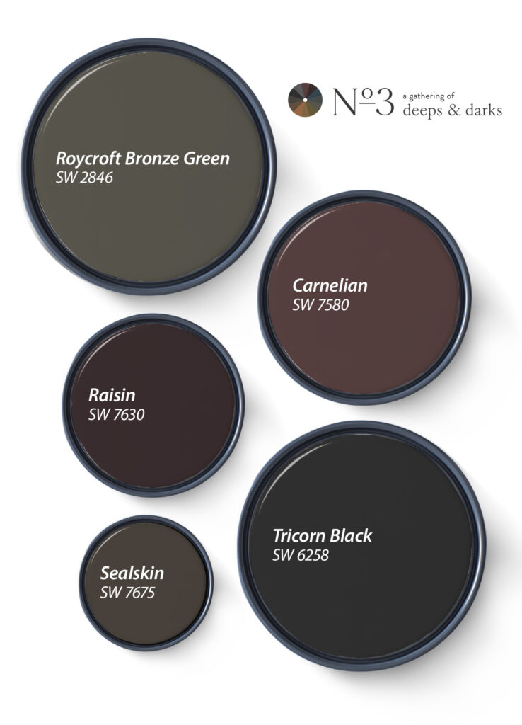
Roycroft Bronze Green SW 2846: This historic, deep forest green hue brings a vintage feel to spaces and is stunning either as an accent or drenching an entire space. Roycroft Bronze Green’s grounded, earthy tone instills a sense of tranquility, effortlessly creating harmonious, nature-inspired spaces.
Carnelian SW 7580: Carnelian’s deeply saturated burgundy hue inspires an intriguing aura of mystery. It’s the perfect shade for going dark without diving all the way into the depths of an inky black.
Raisin SW 7630: Looking for a little drama? Raisin’s rich, dark brown hue adds a captivating allure to any space. This chameleon shade’s purple undertone lends it an easy versatility that can lean either warm or cool depending on surrounding tones and lighting.
Sealskin SW 7675: Sealskin has a refined, deep tone that creates a contented, cocoon-like atmosphere. This bold shade easily wraps spaces in luxurious, inviting warmth and adds nuanced sophistication. Moody enough to inspire quiet reflection yet classic enough to feel elegant.
Tricorn Black SW 6258: A long-standing fan favorite, Tricorn Black is one of our deepest, truest blacks. With virtually no undertones, this timeless neutral shade is supremely versatile, effortlessly pairing with any material, tone, or texture.
Explore the full collection of shades in the A Gathering of Deeps & Darks palette in Anthology: Volume One, our Colormix ® Forecast for 2024. Want to see these hues in your space? Get FREE color chips for the whole palette, and if you need help choosing, book a FREE Virtual Color Consultation for personalized, one-on-one guidance with one of our experts.
**A personal note: I am usually pleased with the colors chosen by Sherwin Williams, this color was not a favorite of mine, but when you POP it with some color . . . it did change my mindset about the color. Pair up SW6605 Charisma with the SW7580 Carnelian . . . Gorgeous!